Depot - Empowering Decathlon NL Employees
Opdrachtgever:
Decathlon Nederland
Type:
Product design
I’m excited to share a project I’ve been working on called Depot. It’s a special tool made for Decathlon NL employees. I’ve spent a lot of time designing it to make work easier and encourage teamwork.
Depot isn’t just any tool. It’s a place where employees can quickly find important information like product details, company rules, training, and team news. It’s all in one easy-to-use system.
But Depot does more than store information. It’s also a place where employees can share ideas for projects. This helps everyone communicate better and turn ideas into real projects that help the company grow.
I’m really proud of how Depot has helped Decathlon NL, and I’d love to tell you more about it. Let’s talk about how it’s changing the way employees work together and get things done.
If you want to see the design file, just let me know!
Research Phase - Inspiration
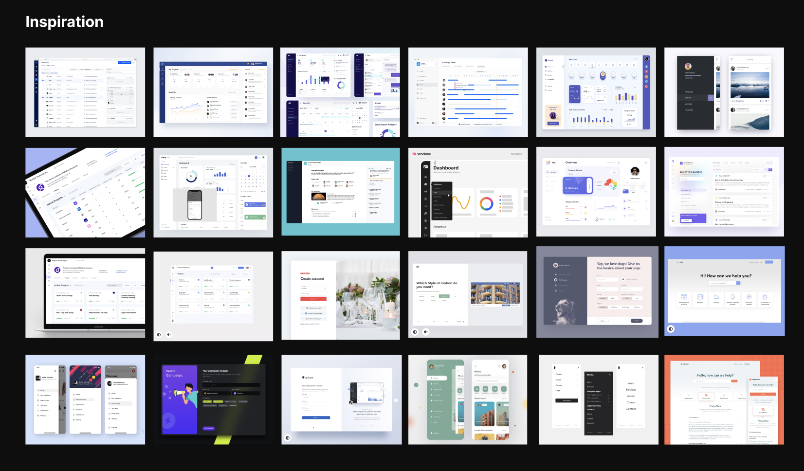
As a UI designer for this project, I began by researching online to get ideas for the design. This step helped me gather inspiration and understand what works well in similar projects. I’ll be showcasing this research phase in my online portfolio to demonstrate my process and the thought behind the design choices.

Hi-Fi Wireframing
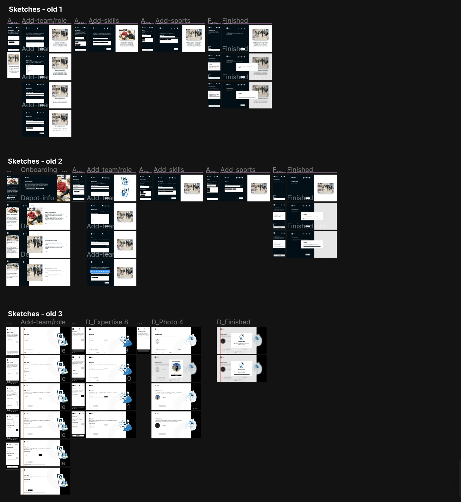
After the initial research phase, I proceeded to the High-Fidelity (Hi-Fi) wireframing process. I chose to start with Hi-Fi wireframes because there was a sense of urgency behind the project. Depot, being primarily used on desktop devices, demanded a swift yet detailed approach to its design. By focusing on desktop users first, I could ensure a seamless user experience for the majority of Depot’s audience. I’ll be showcasing this phase in my online UI portfolio to demonstrate not only the urgency but also how I translated initial concepts into fully functional desktop interfaces.

UI design & Animating
The next step involved creating the final user interface (UI) designs. During this phase, I brought the project to life by implementing the final designs and adding some engaging icon animations. This stage allowed me to refine the visual aspects of Depot and add subtle interactions to enhance the user experience. I’ll be presenting this process in my online portfolio to showcase how I transformed the wireframes into polished, interactive designs, complete with dynamic icon animations.
Let's grab a coffee!?
Looking for a collaboration or just want to get to know each other? Contact me below and let's schedule a (virtual) coffee meeting!
- +316 34977602
- patrickveldt95@gmail.com
