Decathlon’s New E-Bikes
Opdrachtgever:
Decathlon Nederland
Type:
Branding/Landingpage
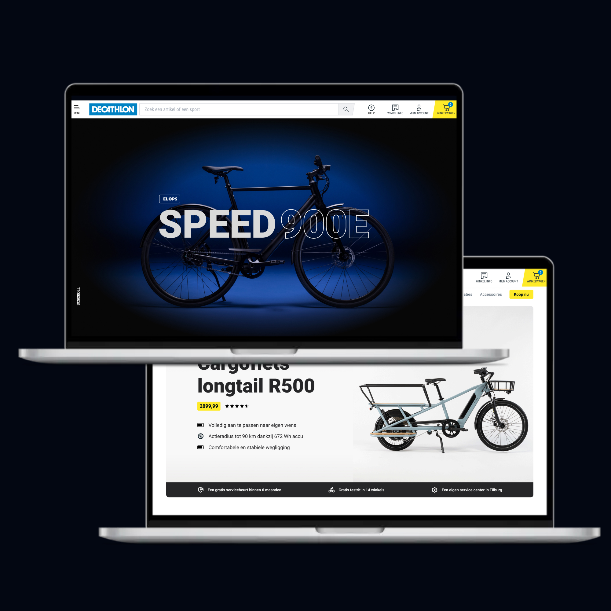
At Decathlon, I had the chance to work on a project that combined design with innovation in sustainable urban mobility. I designed three landing pages for Decathlon’s electric bikes: the Elops Cargo Longtail R500, Elops E LD 500, and Elops Speed 900E.
These e-bikes represent a new era of cycling, where technology meets eco-consciousness. Each landing page was designed to showcase the bike’s unique personality and features, while highlighting Decathlon’s commitment to quality, style, and sustainability.
Take a look at the landing pages I created. I’m proud of how they turned out and excited to share them as part of my work in UI design and the future of mobility.
Research Phase
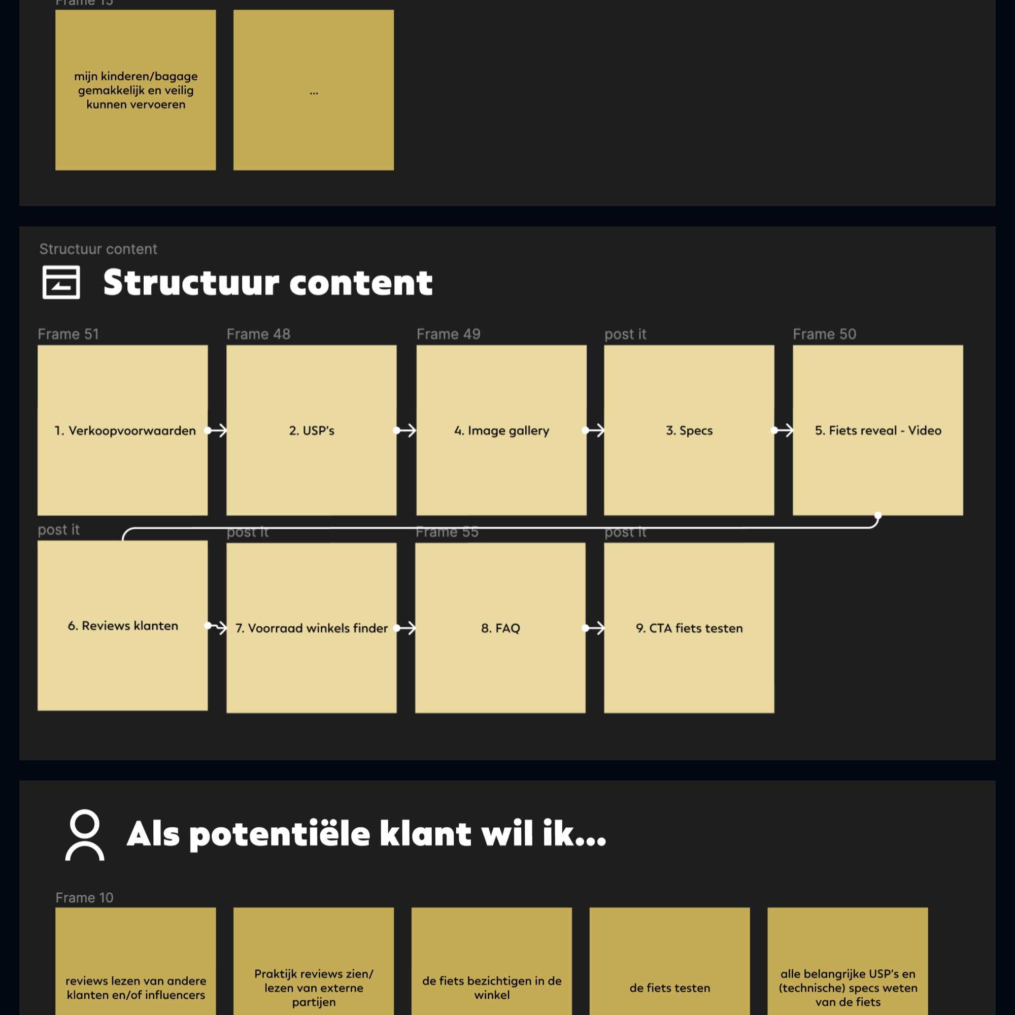
The goal of this e-bike campaign was to draw more attention to Decathlon’s electric bikes, focusing on the Elops 900E and Cargo R500. Since these are very different bikes, we started by identifying the target audience for each. The Cargo R500 was mainly aimed at families with kids, while the 900E focused on younger riders who care about style and aesthetics.
For each bike, we mapped out:
The needs of the target audience.
The key features and characteristics people look for.
The information customers need when deciding on an e-bike.
Wireframing
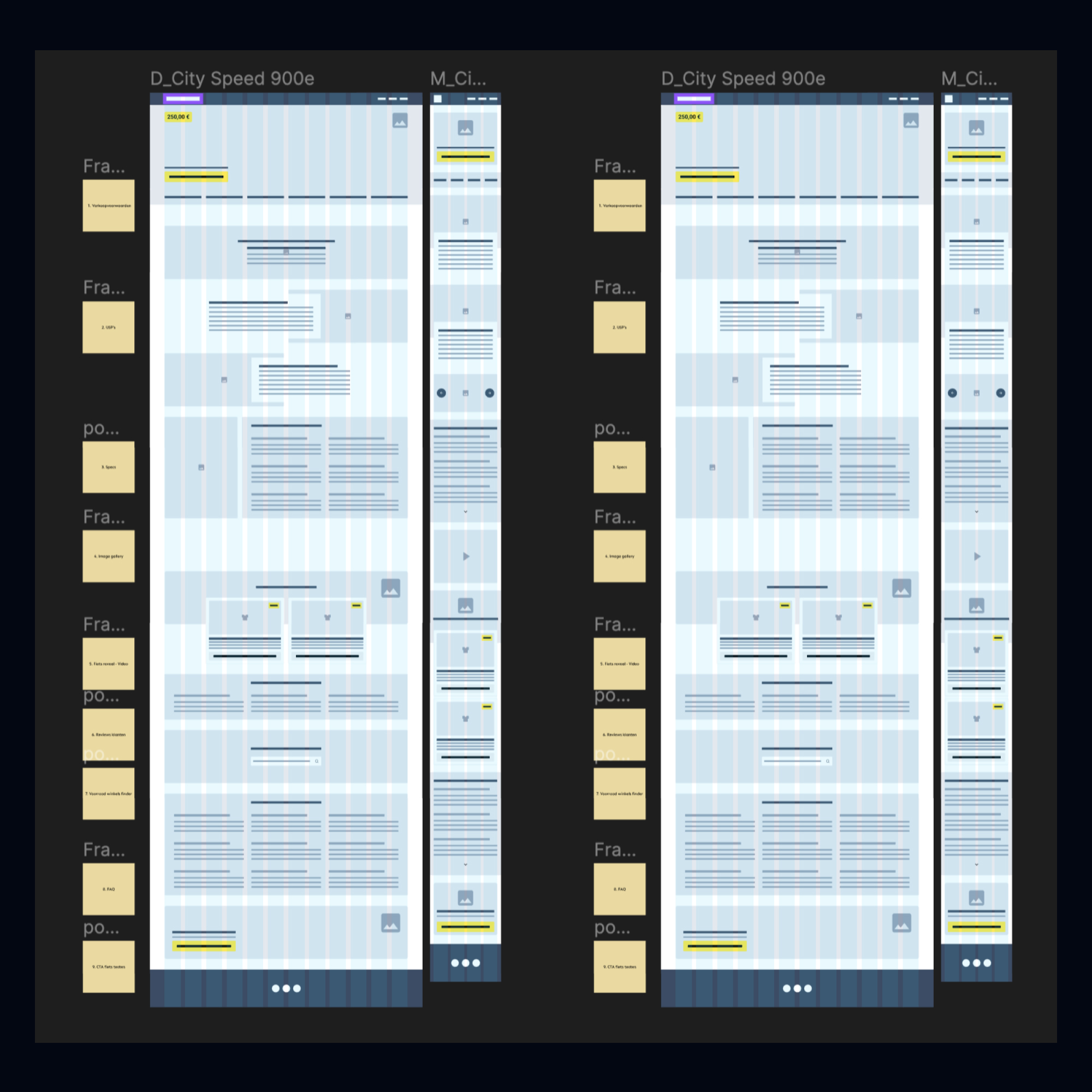
Once the target audiences were clear, we moved on to designing the page structure. This meant prioritizing key information, thinking through interactions, and making sure navigation was easy and engaging throughout the page.
Moodboards & Styling
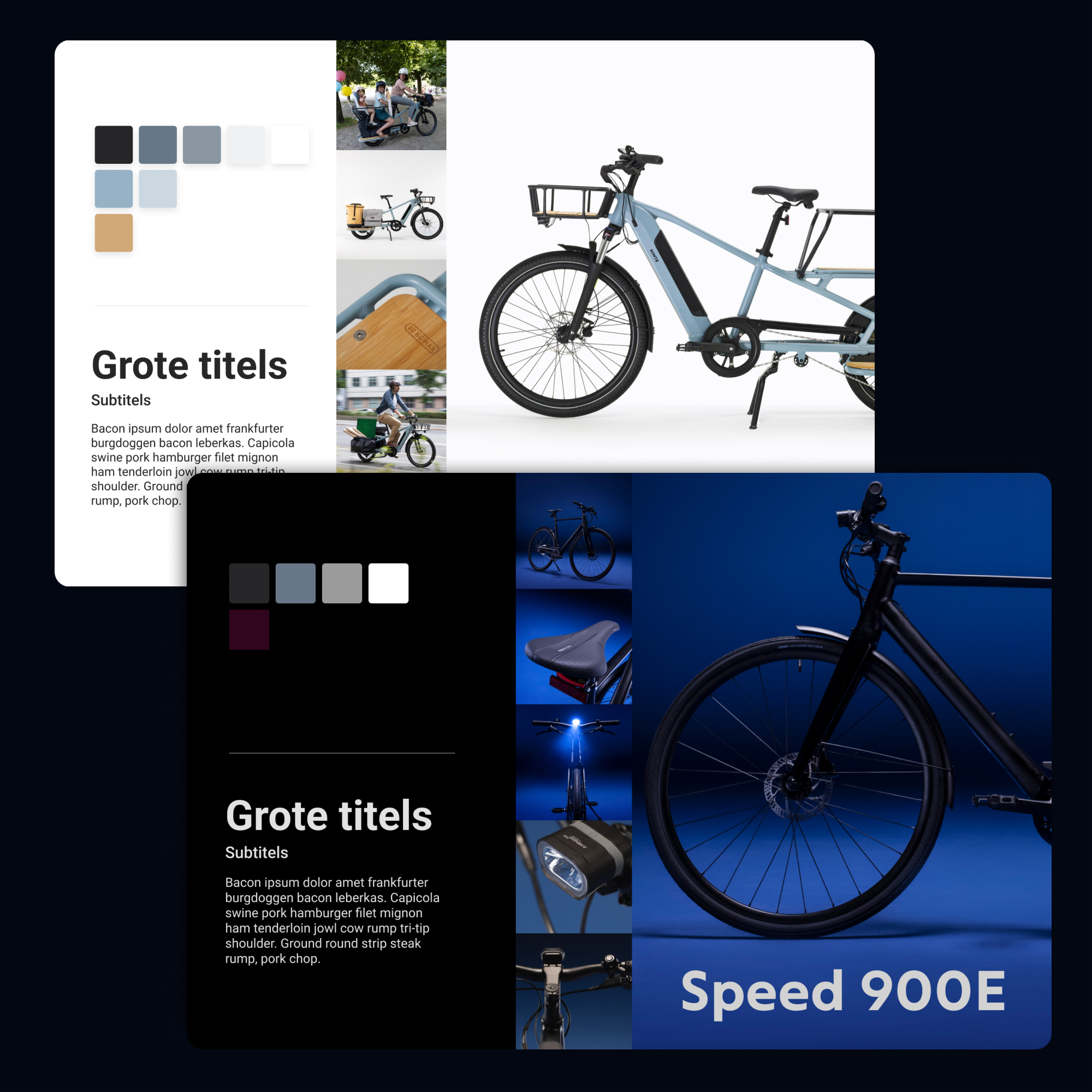
Working closely with the marketing, communication, and design teams, we developed the styling for the campaign. This wasn’t just for the landing pages, it extended across the entire customer journey. Our goal was to create a recognizable look that worked consistently across paid social, in-store, and online platforms.
UI design & Animating
Designing the UI and animations for the e-bike pages was an exciting process. My focus as a UI designer was on creating an interface that’s both easy to use and visually appealing. I paid attention to every detail to ensure a smooth experience, while using thoughtful design elements and subtle animations to highlight the bikes and enhance browsing. This project reflects my passion for crafting engaging digital experiences that stick with users.
Let's grab a coffee, or two.
Looking for a collaboration or just want to get to know each other? Contact me below and let's schedule a (virtual) coffee meeting!
